REC709
REC709
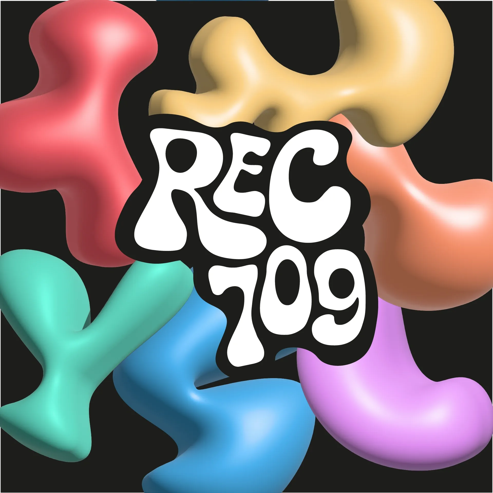
A logo and colourful shapes for a young creative team.
The context
REC709 brings together a young team with complementary skills in marketing, multimedia content, search visibility and website creation.
The brief
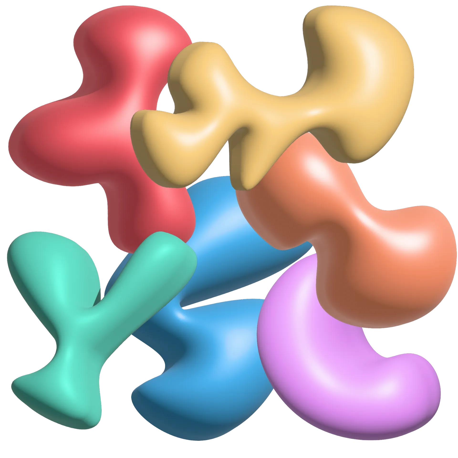
The organic shapes of the logo express the team’s energy. Each colour represents an area of expertise. Red — marketing. Orange — multimedia content. Purple — search engine optimisation (SEO) and search advertising (SEA). Green — websites.
Deliverables
A logo and a family of colourful shapes presenting REC709’s different areas of expertise.
The project in images
Credits
- Lothar HempelVisual identity